Making a Mustang a Mustang
Redesigning the Mustang Mach-E’s digital cockpit to restore a cohesive, performance-driven identity.
Overview
The Ford Mustang Mach-E is Ford's first all-electric SUV and the first to carry the Mustang name into an entirely new vehicle category. The Mustang badge carries a specific promise: boldness, tension, and performance.
While the Mach-E delivers mechanically, its digital cockpit fails to carry that promise forward. The cluster and infotainment adopt a neutral, efficiency-focused visual language that feels disconnected from Mustang's heritage, leaving a gap between what the car is capable of and what the driver experiences.
This project redesigns the Mach-E's digital cockpit to close that gap, creating a cohesive cluster and ICS experience that restores Mustang's performance identity while respecting the practical demands of an everyday EV driver.
Problem
In automotive UX, branding is not purely aesthetic. The interface shapes driver expectation, emotional engagement, and perceived performance before a single button is pressed. For a nameplate as identity-driven as the Mustang, that responsibility is even greater.
The current Mach-E interface is clean and usable, but it reads as a generic EV rather than a Mustang. Three friction points define the gap:
Lack of Mustang Identity
The visual language adopts a neutral, tablet-like aesthetic that underrepresents the boldness and mechanical intensity the Mustang brand has always embodied.
Fragmented System Design
The cluster and infotainment operate as visually and functionally separate systems, breaking the coherence of the driver's experience across their two primary touchpoints.
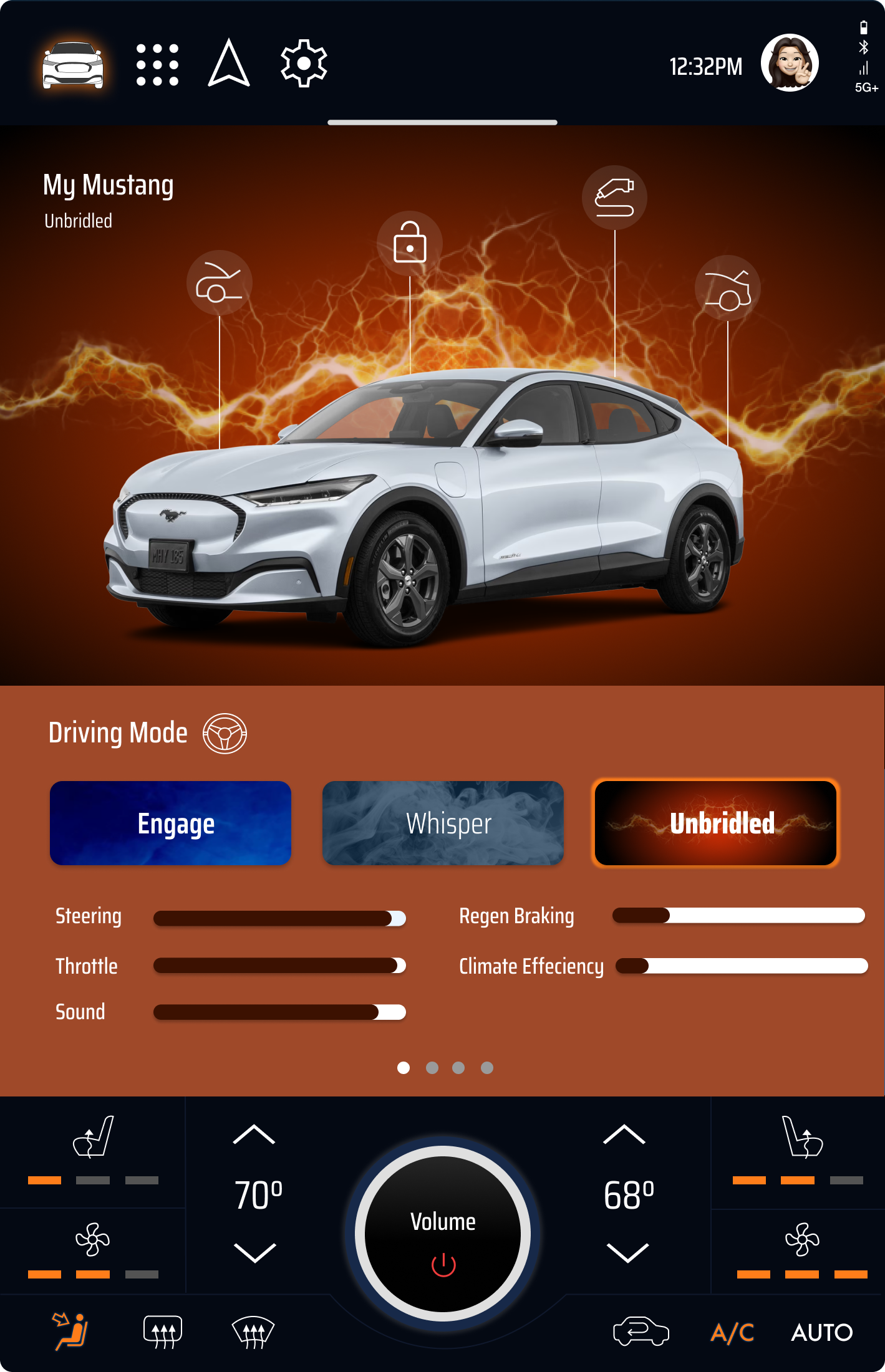
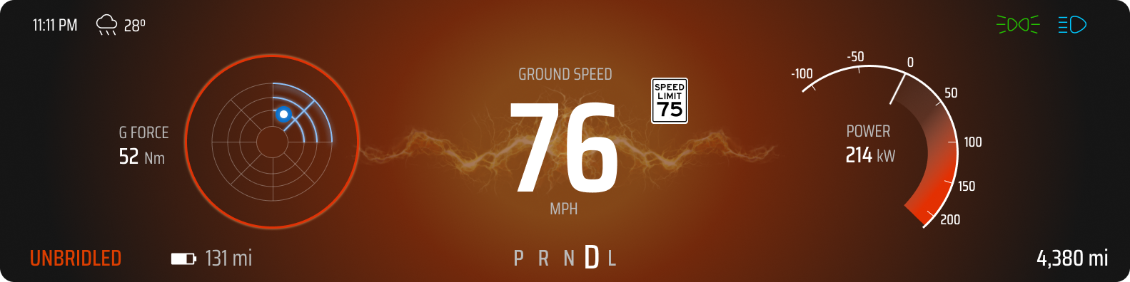
Underdeveloped Drive Modes
Whisper, Engage, and Unbridled introduce behavioral variation, but lack the meaningful visual and emotional differentiation that would make each mode feel distinct and purposeful.
The system is functional. It just doesn't feel like a Mustang.
Goals
Performance-driven identity
Restore a visual language that reflects Mustang's heritage and mechanical intensity.
Unified system
Bring the cluster and infotainment together into a cohesive interaction experience.
Meaningful mode differentiation
Create distinct visual and emotional personalities across Whisper, Engage, and Unbridled.
Balanced intensity
Match the emotional energy of the Mustang brand while respecting the practical demands of an everyday EV driver.
Role
UX Designer
UX Researcher
Interaction Designer
Tools
Figma
FigJam
Adobe Photoshop
Screens Studio
Pinterest
Timeline
Spring 2025
3-Week Concept Sprint
Context
SI 611 Advanced Automotive UI · Final project · University of Michigan, Master of Science in Information
1 Research and Discovery
Analyzing legacy, perception, and system constraints to define the design gap.
To identify where the Mach-E's digital experience falls short, I analyzed three areas: the historical evolution of Mustang's dashboard design, real owner sentiment from forums and reviews, and the functional constraints of the current cluster and ICS.
Historical Interface Analysis
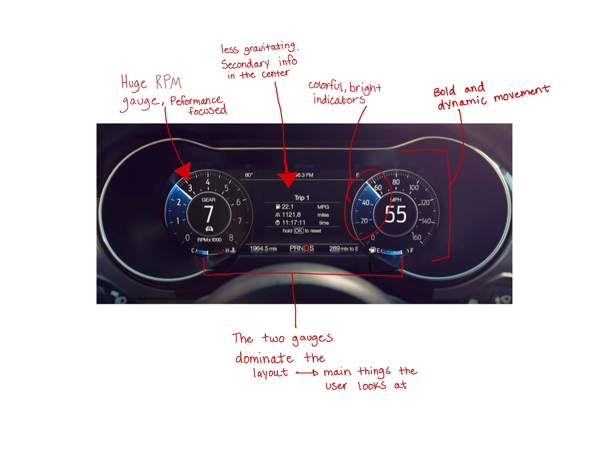
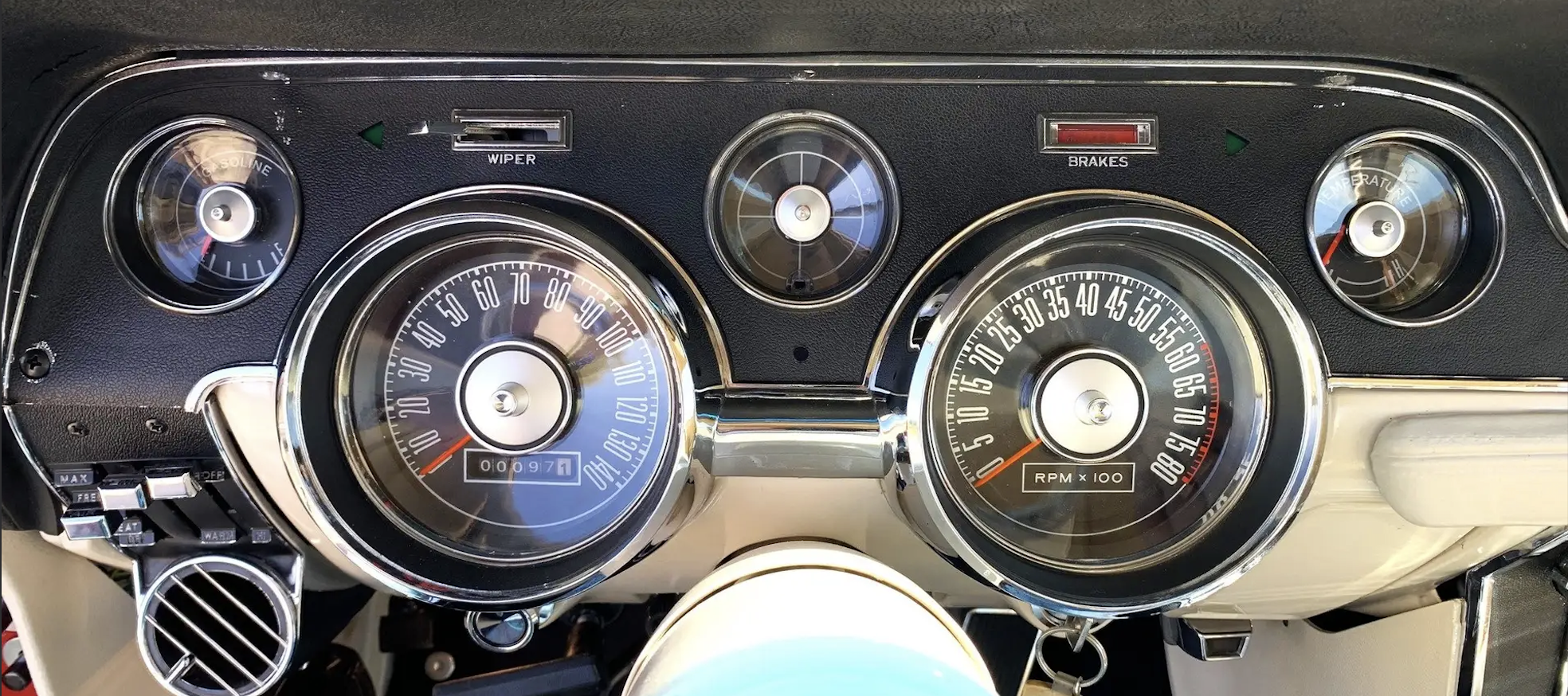
The Mustang dashboard has always centered performance. Classic analog clusters emphasized tachometer dominance, circular symmetry, and high contrast, reinforcing speed, tension, and mechanical power through every design decision.
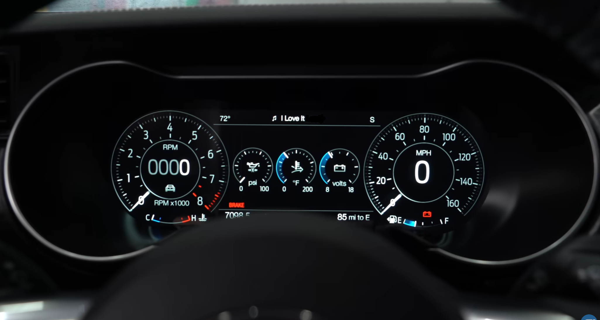
The 2019 Mustang GT digital cluster modernized that identity while preserving its hierarchy. Strong contrast and tachometer emphasis translated analog intensity into a digital system without sacrificing what made it feel like a Mustang.
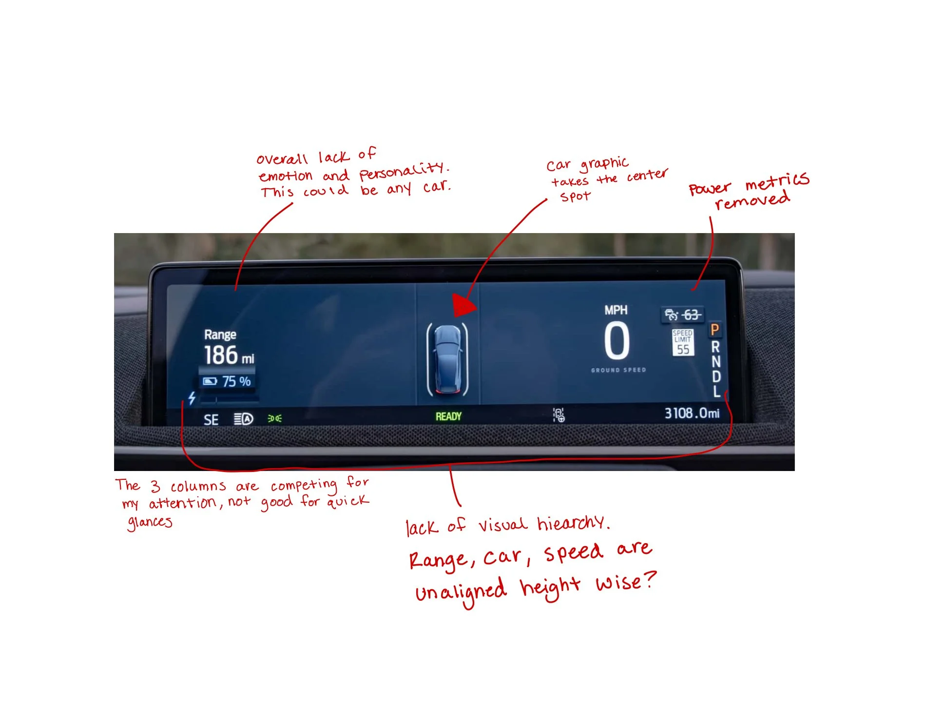
The Mach-E takes a different approach. The interface prioritizes spatial clarity and EV efficiency, minimizing visual tension in favor of legibility. In doing so, it deprioritizes the performance cues that have defined the nameplate for over 60 years.
Key Observations
Classic Mustangs centered performance metrics as the dominant visual anchor
The 2019 digital cluster preserved performance hierarchy within a modern layout
The Mach-E shifts toward neutral minimalism and reduced contrast
Performance cues are visually secondary to efficiency metrics
2019 Mustang GT (S550 Digital Cluster) - A digital reinterpretation of classic performance dials. Strong contrast and tachometer emphasis maintain Mustang’s bold, driver-focused character in a modern interface.
1967 Mustang GT - Bold circular gauges and mechanical symmetry reinforce a performance-first identity. The layout centers the driver’s focus on speed, feedback, and control.
2024 Mustang Mach-E - A minimalist EV layout prioritizing clarity and efficiency. The shift toward neutrality reduces the performance-driven hierarchy seen in previous generations.
To further analyze the gap, I conducted a side-by-side visual audit of the 2019 Mustang GT cluster and the Mach-E cluster, annotating key differences in hierarchy, performance emphasis, and brand expression.
Owner Sentiment and Perspective
To understand how drivers perceive the Mach-E's digital experience, I reviewed discussions from Mustang and Mach-E owner forums and Reddit threads. While drivers acknowledge the vehicle's performance and EV capabilities, recurring feedback reveals a tension between brand expectation and interface expression.
Several owners described the experience as feeling disconnected from Mustang heritage. Drive modes were noted to lack clear visual differentiation, relying on subtle color shifts rather than meaningful changes in layout or hierarchy. Recent over-the-air updates also drew criticism for deprioritizing speed visibility, affecting glanceability and driver confidence.
“It’s like if they released something that looks like a Hummer but called it a Prius… it’s just wrong.”
Beyond the external design of this Mustang, owners also expressed frustration with how the digital interface prioritizes information—particularly following recent over-the-air updates that changed the instrument cluster layout.
“My speedometer showed the speed right in the center of the screen. Now I have a car in the center and my speed is pushed all the way to the right where my steering wheel blocks it… it’s a total waste of space.”
These insights clarify the need to restore visual hierarchy, differentiate driving states, and reintroduce performance emphasis so the digital experience feels unmistakably Mustang.
Infotainment System Analysis
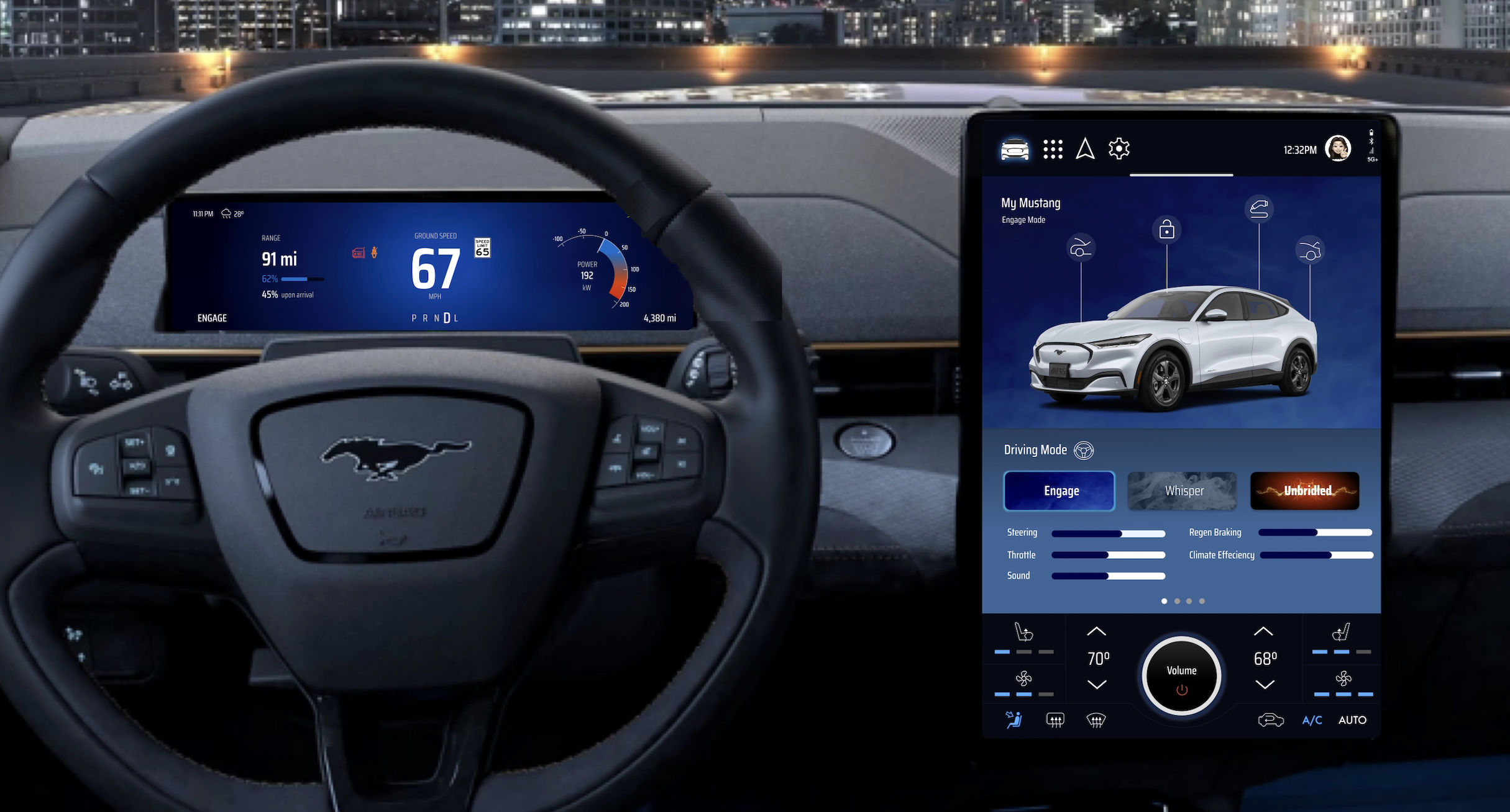
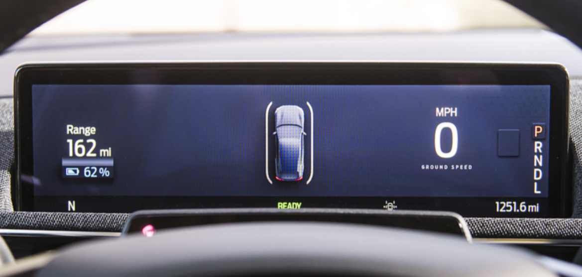
The infotainment screen serves as the primary hub for navigation, media, vehicle settings, and climate control. While organized and functional, it operates as a visually separate system from the cluster. There is no shared visual language, color system, or hierarchy connecting the two screens. Switching attention from one to the other feels like switching between two different interfaces rather than navigating a unified cockpit which is directly undermining the goal of a cohesive driving experience. The screen shares the same generic visual language found across other Ford vehicles, with nothing to signal that this is a Mustang. In contrast, the standard Mustang's digital cockpit demonstrates what a unified system looks like.
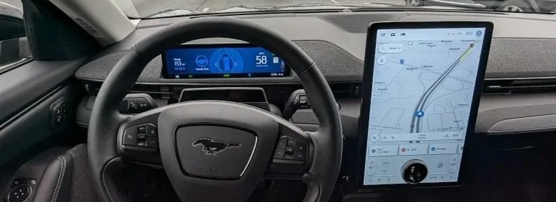
Current Mach-E infotainment screen - Visually disconnected from the cluster with no cohesive system identity.
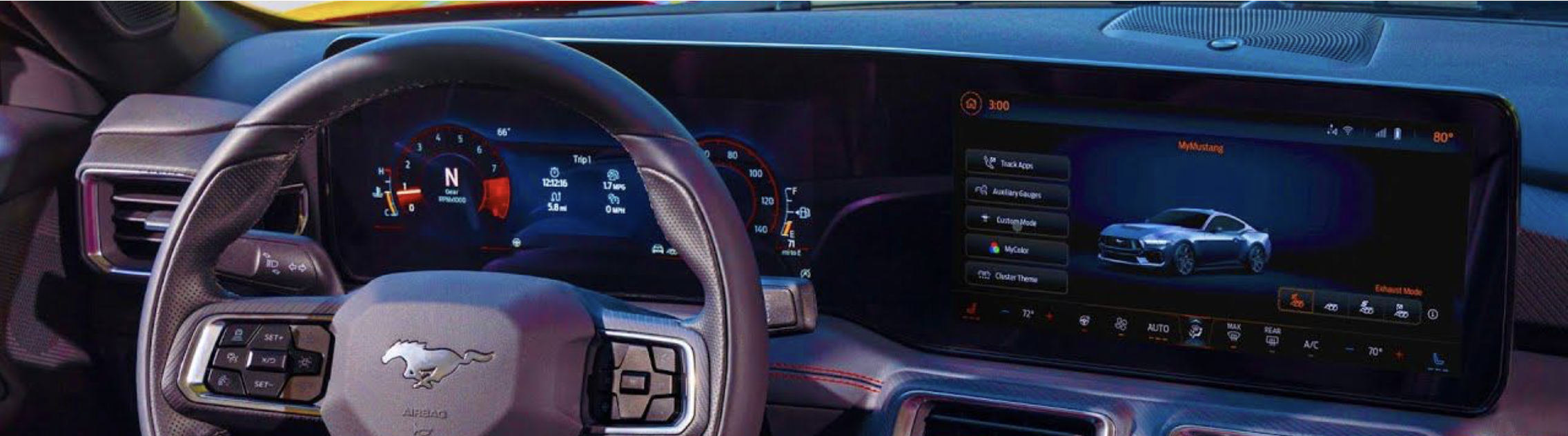
Standard Mustang digital cockpit - A unified visual system where the cluster and infotainment share a consistent design language.
2 Design Direction
Establishing the visual language, tone, and system identity for the redesign.

Design Principles
Three principles guided every design decision in this project.
Bold and Dynamic
Follow Mustang's confident, powerful, and kinetic presence that it has always had.
Emotional Energy
Bright, energizing colors (Ford blue and orange/red) and dynamic designs that are engaging and evoke feeling.
Balanced Comfort for Daily Use
The Mach-E is an SUV driven every day. The design cannot be so performance heavy that it becomes exhausting to use.
3 - Wireframing and Prototyping
Key Design Decisions
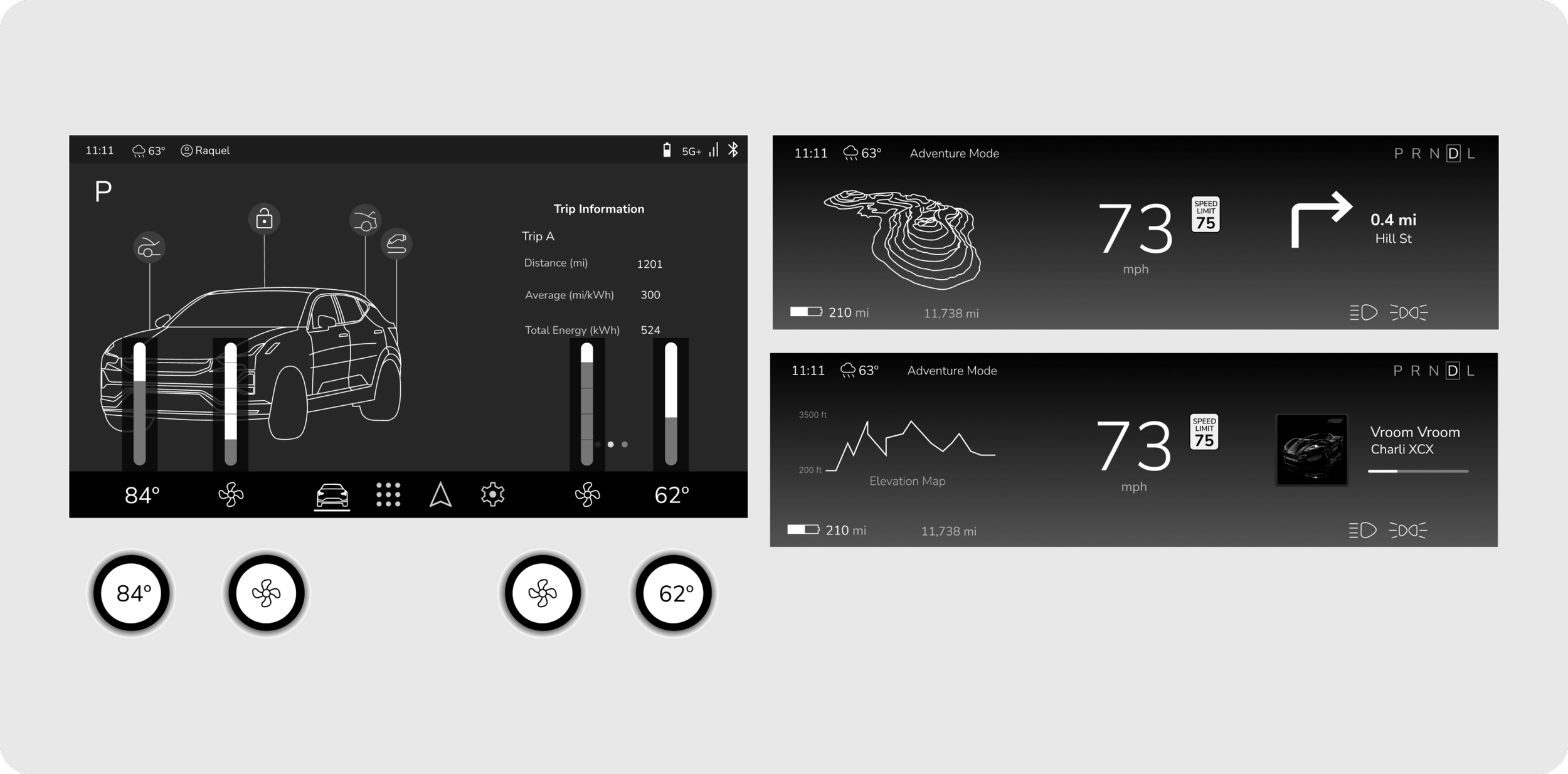
Customizable Driver’s Display
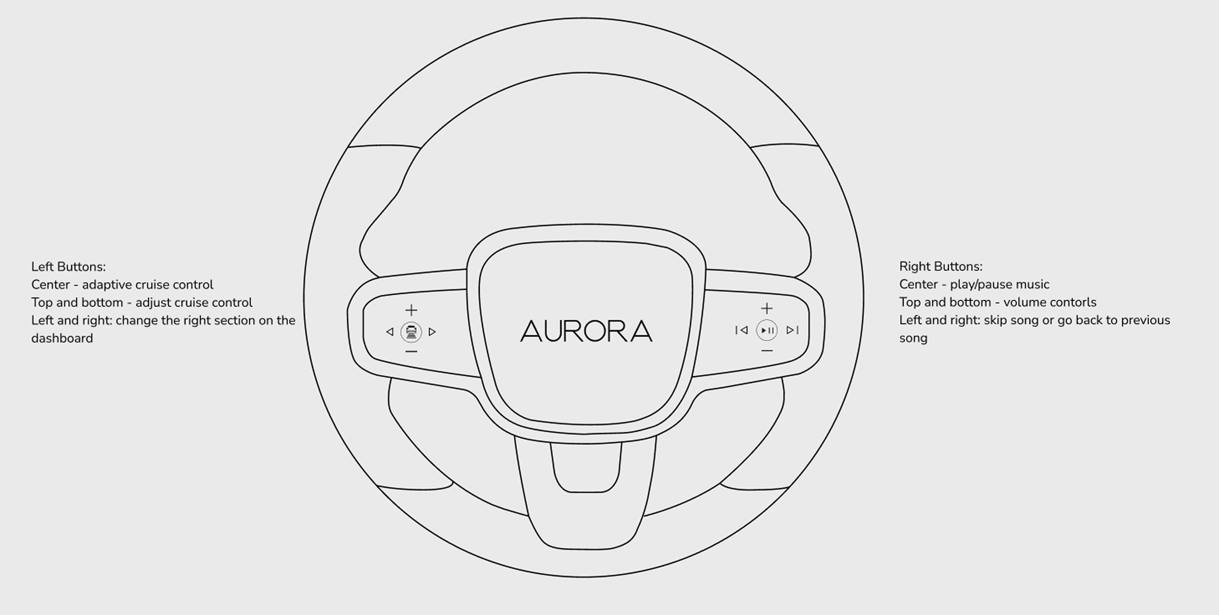
Users can change the media information on the drivers display using the steering wheel buttons
A customizable driver’s display allows the user to choose their own driver’s display layout for their personal or daily needs. The user can display media such as music and navigation directions.
Driving modes have different content that can be displayed.
Due to the adventurous nature of the users, it was key to emphasize the adventure aspects that the Momentum offers such as the “Adventure Mode” driving mode on the driver’s display

Integrated search in navigation with location details and community features
To fit the active and adventurous lifestyle of the Momentum consumer, there is a 3-D model of the elevation and hiking trails (or off-road trail) of the destination.
Star ratings of hiking and “adventure” locations from other Momentum drivers.
Integrated search and details of popular “adventure” locations allows the user to feel a sense of community and makes planning the next trip fast.
The user can save this location to their profile for a different time.

Smart Buttons for HVAC, Gear Shift, and Volume
The four smart buttons are designed for quick and intuitive HVAC control, gear shifting, and adjusting the volume without having multiple physical buttons.
These buttons change based on the display screen the user is currently on and also whether a button on the screen was clicked.
There is no physical PRND handle or button in the car. Therefore I designed one of the static buttons to host the PRND. Once the PRND button is pushed, the parking brake activates.
Both the drivers and passenger sides have access to a volume control to make changing the volume accessible for both users.

Style Guide

Sketches
I then began multiple iterations of sketching to further define the information architecture of each display and the features within them. Creating these sketches allowed me to physically test the layout on a screen with similar dimensions to understand how it would actually work in a car and if it was fluid.
I also was able to take my time to map out the functionality of each feature and how it would be used by the user.

Final Wireframes

Key Takeaways and Learnings
Adaptation and Innovation
Designing in the automotive space highlights the need for continuous innovation. Strict regulations require an adaptive design process. Despite these constraints, the industry is evolving, especially in screen designs and UX principles. This prompted me to explore beyond traditional in-car screen functionalities, envisioning the next generation of in-car experiences. Instead of replicating existing systems, I focused on improving usability through dynamic driving modes, adaptive smart buttons, and context-aware navigation. The lack of predefined UX rules allowed me to experiment, iterate, and contribute unique design solutions..
Designing for Safety
A major challenge was ensuring drivers could access key controls without distraction while also creating a visually appealing UI that aligns with Aurora’s brand. To solve this, I iterated on navigation placement, driving mode customization, and smart button interactions to enhance both usability and design coherence.
Creating Structure in an Unstructured Space
With limited industry-wide best practices, benchmarking competitive brands was essential to understanding how modern EVs approach multi-screen interfaces, navigation design, and in-car controls. However, I found that many solutions still have pain points—whether it’s clunky menu structures or distracting touch-based interactions. I discovered that although the EVs I benchmarked are popular and leading brands, that does not mean those are the best practices in this new and changing industry.