Aurora Momentum: Designing a Multi-Screen Infotainment UX for the Future of Driving
Creating an intuitive, personalized, and engaging infotainment system that enhances usability, driving focus, and innovation in automotive UX.
Overview
As part of my Automotive UX course, tasked by Edenspiekermann, I designed the information architecture and low-fidelity multi-screen experience for Aurora’s Momentum SUV, a concept EV. Positioned as a mid-tier SUV, Momentum blends advanced technology with practical features to offer a premium yet accessible driving experience.
The interface prioritizes usability and intuitive interaction, allowing drivers to seamlessly navigate entertainment, navigation, and vehicle diagnostics while staying focused on the road. Designed with emotional appeal in mind, it delivers a modern, engaging experience that makes drivers feel empowered and connected to their vehicle.
My work aimed to craft an intuitive yet luxurious in-car experience that aligns with Aurora’s vision of bridging America’s electric mobility gap while catering to adventurous, hardworking families and everyday drivers.
Problem
Many electric vehicles are either high-end luxury models or affordable but unattractive options, leaving consumers seeking stylish, functional EVs at mid-tier prices with few choices.
Current infotainment systems often focus on aesthetics or usability, lacking a seamless multi-screen experience.
Aurora Momentum aims to fill this gap with a modern, attractive, and advanced infotainment system that balances practicality and style for families and everyday drivers.
Roles
UX Designer
UX Researcher
Tools
Figma and FigJam
Adobe Photoshop
Screens Studio
Pinterest
Goals
To design an intuitive and aesthetically refined multi-screen infotainment system that balances usability, emotional appeal, and functionality.
Understand and learn the current practices of information architecture that are being used by similar brands for the driver’s display, central, and heads up display and adapting for no physical buttons
Bridge the gap between luxury EVs and affordable, uninspiring models by offering a premium mid-tier experience that feels personalized and new to the user.
Timeline
April 2024
2 Weeks to Complete
Design Process
Research and Discovery
Ideation
Design
1 - Research and Discovery

Competitive Benchmarking
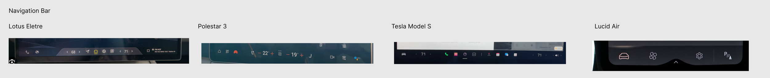
I conducted a benchmarking analysis of best practices in multi-screen infotainment systems among innovative EV SUV companies. Using Screens and YouTube videos of car interiors, I captured images of the screens and noted their key features on the navigation bar, driver’s display, and vehicle settings pages.
Given the list of required features the screens must include and Aurora’s brand mission, I decided to benchmark electric SUVs and cars that aligned with Aurora’s wants and brand needs such as:
Lotus Eletre
Polstar 3 & 4
Lucid Air
Tesla Model S

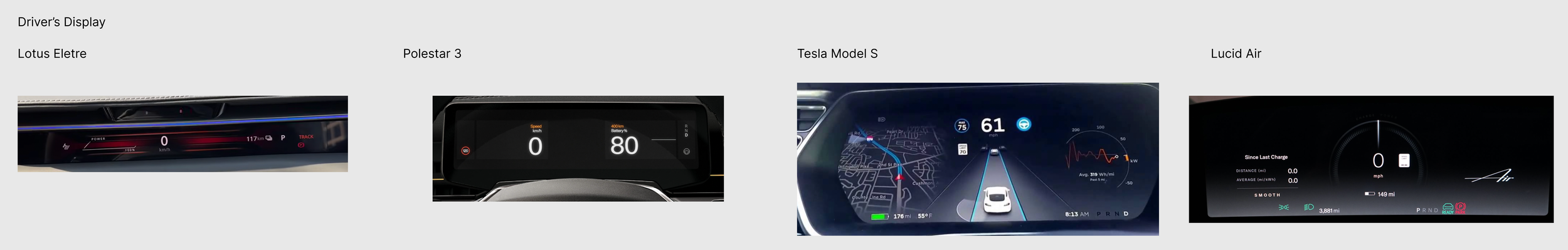
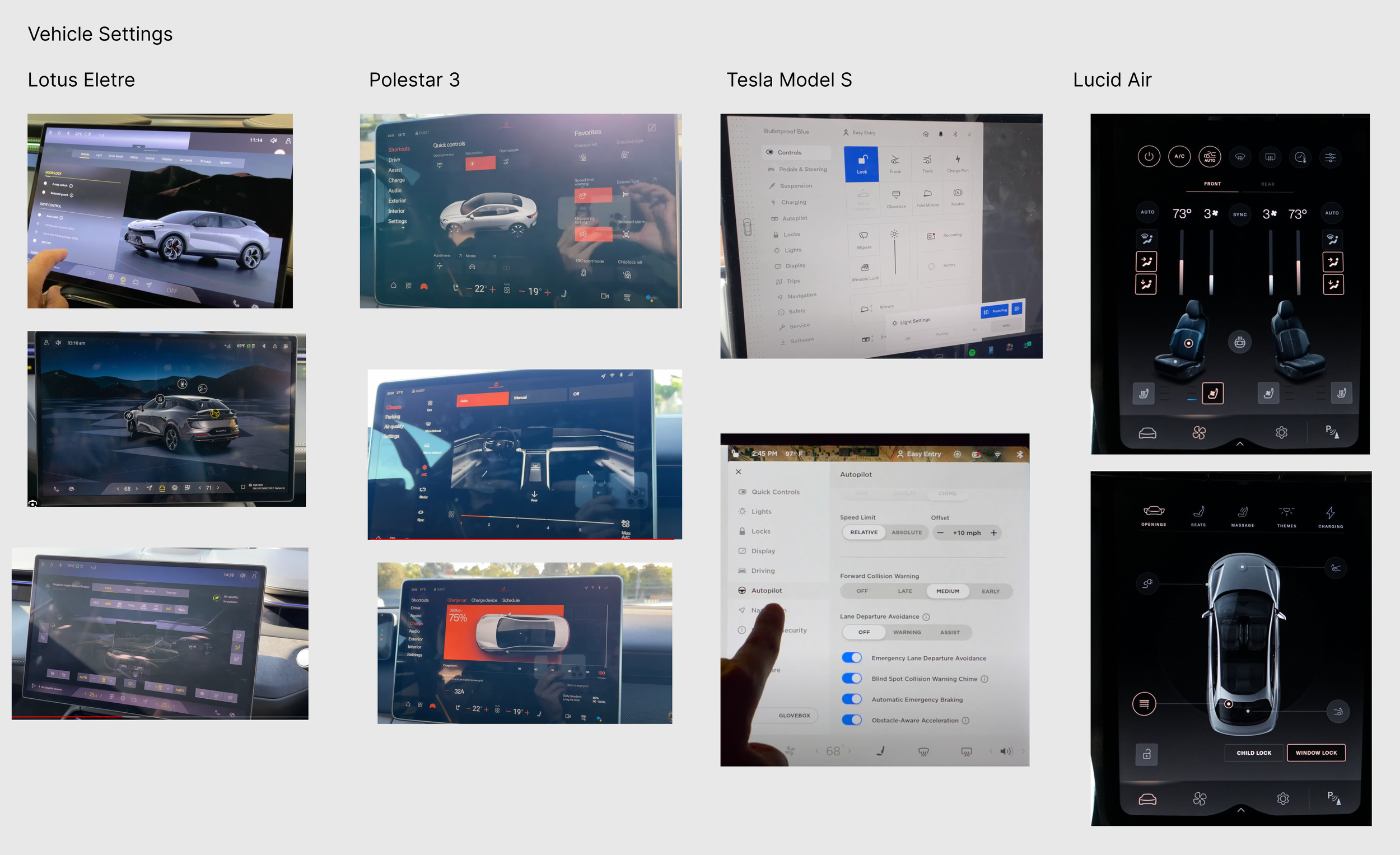

Main Benchmarking Takeaways Incorporated into my Designs
Tesla and Polestar change the driver’s display layout when different driving modes (Sport, Eco, Normal) are activated, adjusting color schemes, visual emphasis, and displayed data.
Lucid Air and Tesla allow drivers to personalize their driver display and home screens, selecting what data is most important to them
Tesla and Polestar, organize vehicle settings into clear, categorized sections to reduce cognitive load
Tesla, Polestar, and Lucid Air ensure that the navigation bar remains accessible at all times, either as a fixed element or as a swipe-up feature for quick access to core functions
User Identification
Who is going to be driving the Aurora Momentum? Who will you become?
Purchasing a vehicle is not a small decision. A vehicle is meant to represent who you are or who you aspire to be. Therefore, creating a general idea of who the niche group of people this vehicle is being designed for was an important part of the discovery phase.
The design brief stated that Aurora’s mid-level SUV, Momentum, was designed for families and individuals who lead active lifestyles and require a versatile vehicle that can keep up. They appreciate the value proposition of an EV and the additional features the mid-level variant offers.
Through the creation of a photo collage, I was able to envision who the user of the Momentum is going to be.
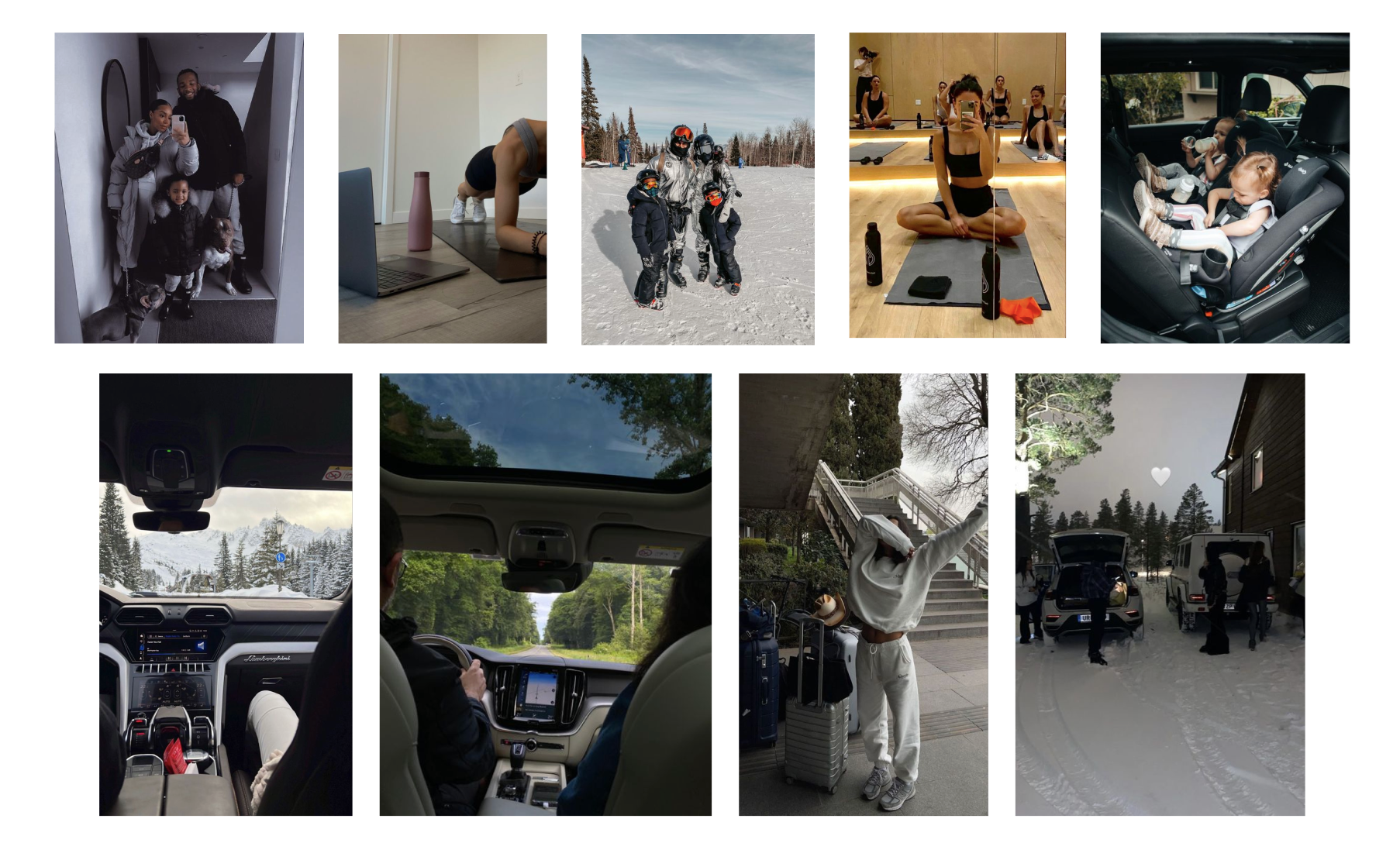
Aurora Momentum SUV drivers:
Have active lifestyles
Always on the go
Middle class adults
Young families
Appreciate aesthetic in life
Like luxurious things, but not the price tag
Environmentally concious
Brand Identity Discovery
Who is Aurora Momentum?
Brainstorming the style of the screen was also an important factor in the final design and architecture. Since Aurora is a concept company, there was no initial branding or personality of the brand. Therefore I had to create the Aurora brand through photo collages and logo creation.
Ideating the brand allowed me to create the screens with the background and style that Aurora UX designers would do on the screens.
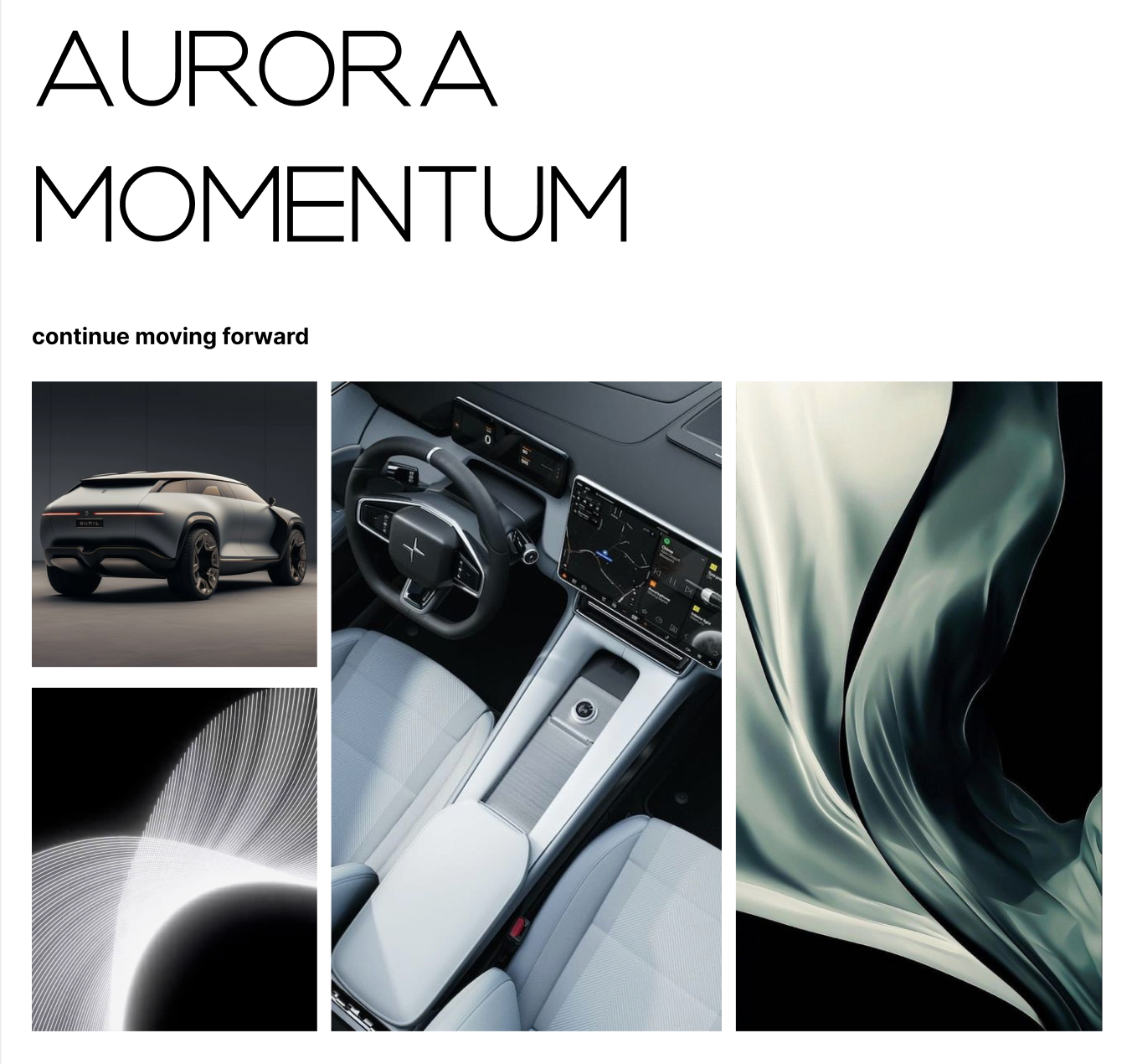
The Aurora Momentum brand identity shaped both the visual style and information architecture of the infotainment system.
The minimalist, futuristic logo inspired a clean, structured interface, while the slogan, “Continue Moving Forward,” influenced a seamless, intuitive navigation flow that keeps key features easily accessible for busy users.
The mood board’s dynamic and sleek aesthetic guided the layout and interaction design, ensuring the system feels fluid, modern, and cohesive with the vehicle’s identity.
2 - Ideation
Brainstorming Sessions
Multiple brainstorming sessions helped define the information architecture and flow for three screens, steering wheel buttons, and four smart buttons. We were given a list of specific features the vehicle needed to include, so I began organizing the flow for those.
During the ideation phase for Aurora's Momentum model, I explored design possibilities using knowledge of the target user group, benchmark analysis, and an understanding of Aurora's brand.
I engaged in sketching and ideation, experimenting with layout structures, interface elements, and visual aesthetics to create an intuitive user experience.
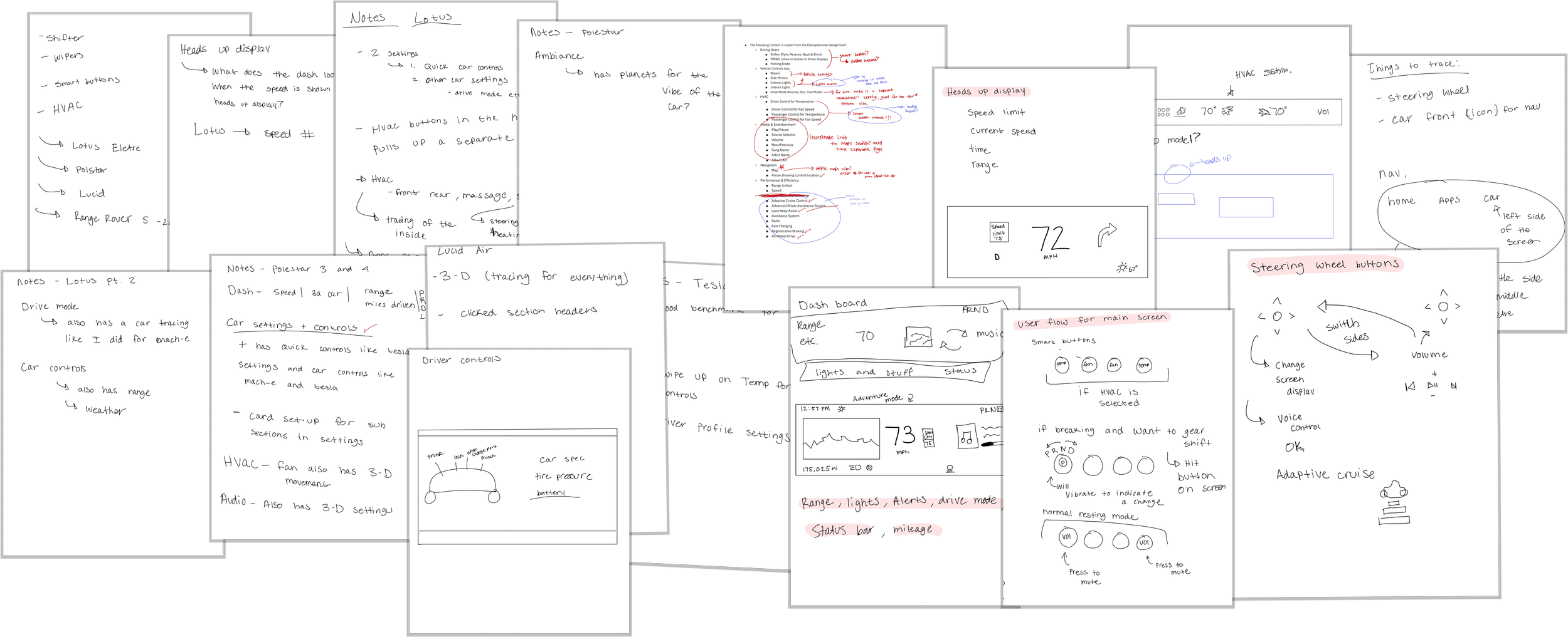
Information Architecture


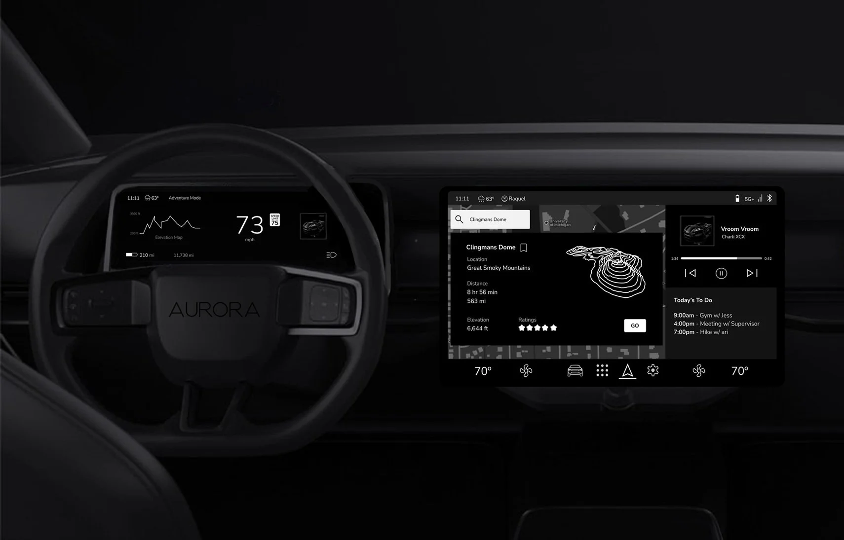
To create a structured and intuitive infotainment system, I first organized the required features into three key screens—Driver Display, Central Touchscreen, and Heads-Up Display (HUD)—then branched out the information architecture (IA) from there. This approach ensured that each screen had a clear function, allowing for seamless interaction and minimal driver distraction.
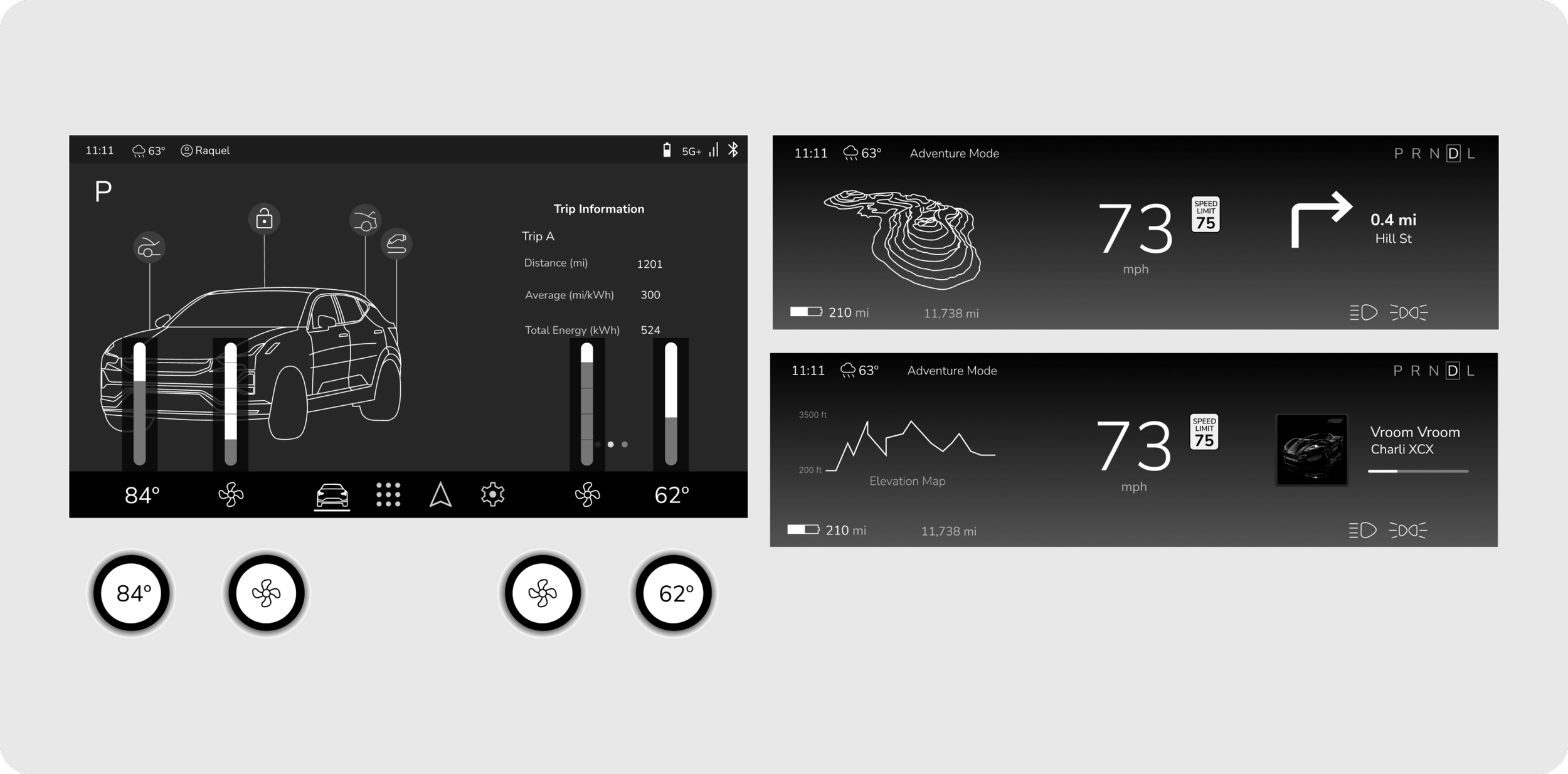
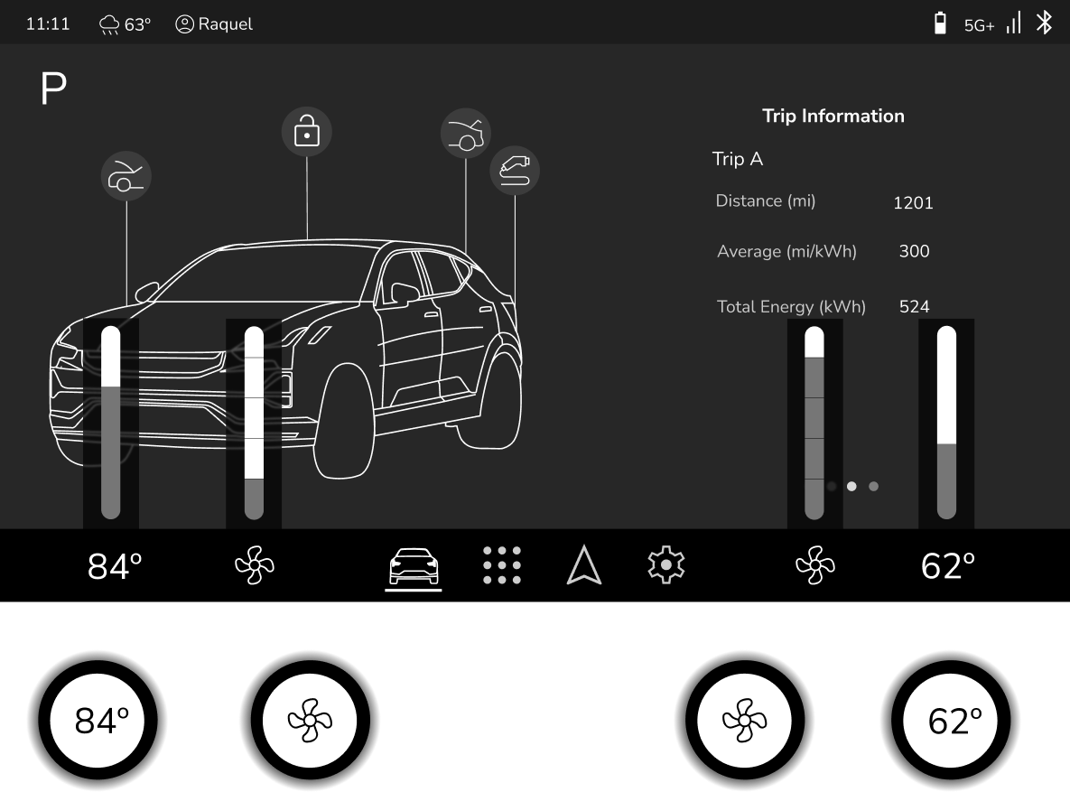
Driver Display → Provides customizable layouts for navigation, media, and real-time vehicle diagnostics, allowing drivers to tailor the display to their preferences, as well as speed.
Central Touchscreen → Serves as the primary hub for navigation, entertainment, and vehicle settings, designed for effortless interaction and quick access to core features. Includes HVAC
Heads-Up Display (HUD) → Projects critical driving information (e.g., speed, turn-by-turn navigation) onto the windshield, keeping drivers informed without taking their eyes off the road.

3 - Wireframing and Prototyping
Key Design Decisions
Customizable Driver’s Display
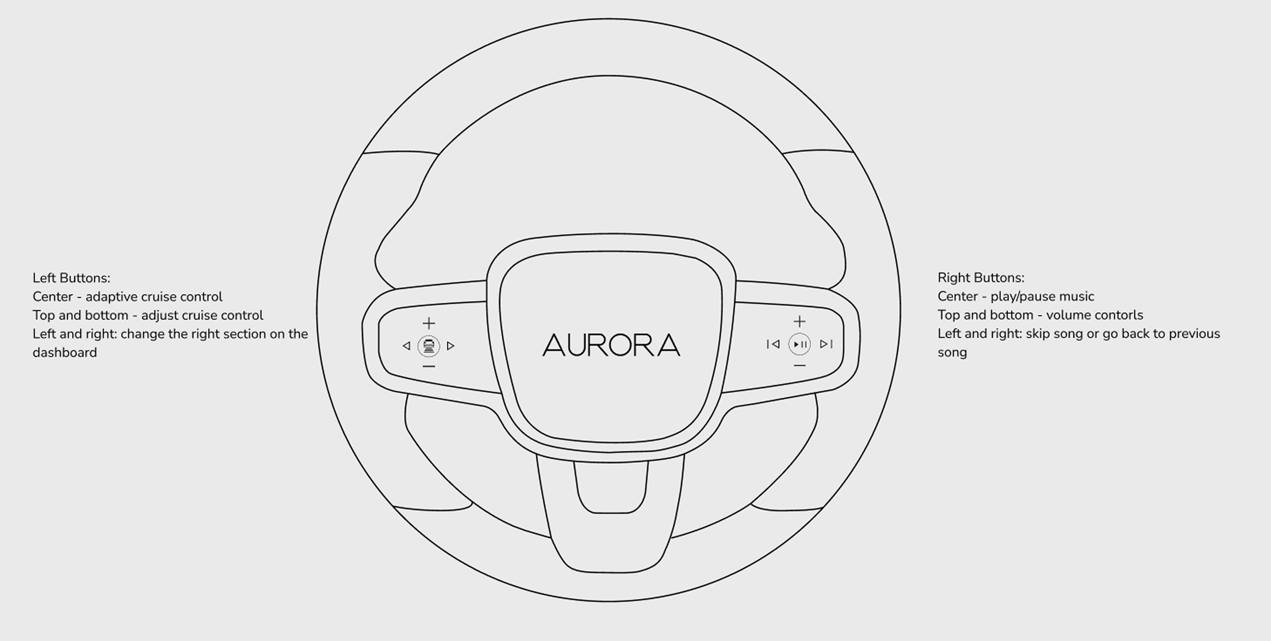
Users can change the media information on the drivers display using the steering wheel buttons
A customizable driver’s display allows the user to choose their own driver’s display layout for their personal or daily needs. The user can display media such as music and navigation directions.
Driving modes have different content that can be displayed.
Due to the adventurous nature of the users, it was key to emphasize the adventure aspects that the Momentum offers such as the “Adventure Mode” driving mode on the driver’s display

Integrated search in navigation with location details and community features
To fit the active and adventurous lifestyle of the Momentum consumer, there is a 3-D model of the elevation and hiking trails (or off-road trail) of the destination.
Star ratings of hiking and “adventure” locations from other Momentum drivers.
Integrated search and details of popular “adventure” locations allows the user to feel a sense of community and makes planning the next trip fast.
The user can save this location to their profile for a different time.

Smart Buttons for HVAC, Gear Shift, and Volume
The four smart buttons are designed for quick and intuitive HVAC control, gear shifting, and adjusting the volume without having multiple physical buttons.
These buttons change based on the display screen the user is currently on and also whether a button on the screen was clicked.
There is no physical PRND handle or button in the car. Therefore I designed one of the static buttons to host the PRND. Once the PRND button is pushed, the parking brake activates.
Both the drivers and passenger sides have access to a volume control to make changing the volume accessible for both users.

Style Guide

Sketches
I then began multiple iterations of sketching to further define the information architecture of each display and the features within them. Creating these sketches allowed me to physically test the layout on a screen with similar dimensions to understand how it would actually work in a car and if it was fluid.
I also was able to take my time to map out the functionality of each feature and how it would be used by the user.

Final Wireframes

Key Takeaways and Learnings
Adaptation and Innovation
Designing in the automotive space highlights the need for continuous innovation. Strict regulations require an adaptive design process. Despite these constraints, the industry is evolving, especially in screen designs and UX principles. This prompted me to explore beyond traditional in-car screen functionalities, envisioning the next generation of in-car experiences. Instead of replicating existing systems, I focused on improving usability through dynamic driving modes, adaptive smart buttons, and context-aware navigation. The lack of predefined UX rules allowed me to experiment, iterate, and contribute unique design solutions..
Designing for Safety
A major challenge was ensuring drivers could access key controls without distraction while also creating a visually appealing UI that aligns with Aurora’s brand. To solve this, I iterated on navigation placement, driving mode customization, and smart button interactions to enhance both usability and design coherence.
Creating Structure in an Unstructured Space
With limited industry-wide best practices, benchmarking competitive brands was essential to understanding how modern EVs approach multi-screen interfaces, navigation design, and in-car controls. However, I found that many solutions still have pain points—whether it’s clunky menu structures or distracting touch-based interactions. I discovered that although the EVs I benchmarked are popular and leading brands, that does not mean those are the best practices in this new and changing industry.